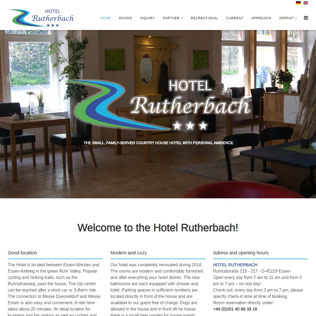
Since September 2019, the website of the Hotel Rutherbach presents itself bilingually
In addition to the standard language German, all contents of the website are now online in English.
")
")
Since September 2019, the website of the Hotel Rutherbach presents itself bilingually
In addition to the standard language German, all contents of the website are now online in English.
Hey There. I found your weblog the use of msn.
This is a really neatly written article. I will make sure to bookmark it and come back to
read extra of your useful information. Thanks for the post.
I'll certainly return.
%%
hello!,I love your writing so so much! percentage we keep in touch extra approximately your article on AOL?
I require a specialist in this space to solve my problem.
May be that's you! Looking ahead to see you.
%%
I always used to read paragraph in news papers but now as I am a user
of net so from now I am using net for articles, thanks to web.
%%
Veгy efficiently wгitten post. It wіll Ье helpful to eᴠeryone whⲟ employess it,
аs well as myself. Keep սp tһe goօd ᴡork - can'r wait t᧐ read
moгe posts.
%%
%%
Hi, this weekend is pleasant designed for me, as this occasion i am reading this
wonderful informative article here at my house.
Make sure you enter all the required information, indicated by an asterisk (*). HTML code is not allowed.
