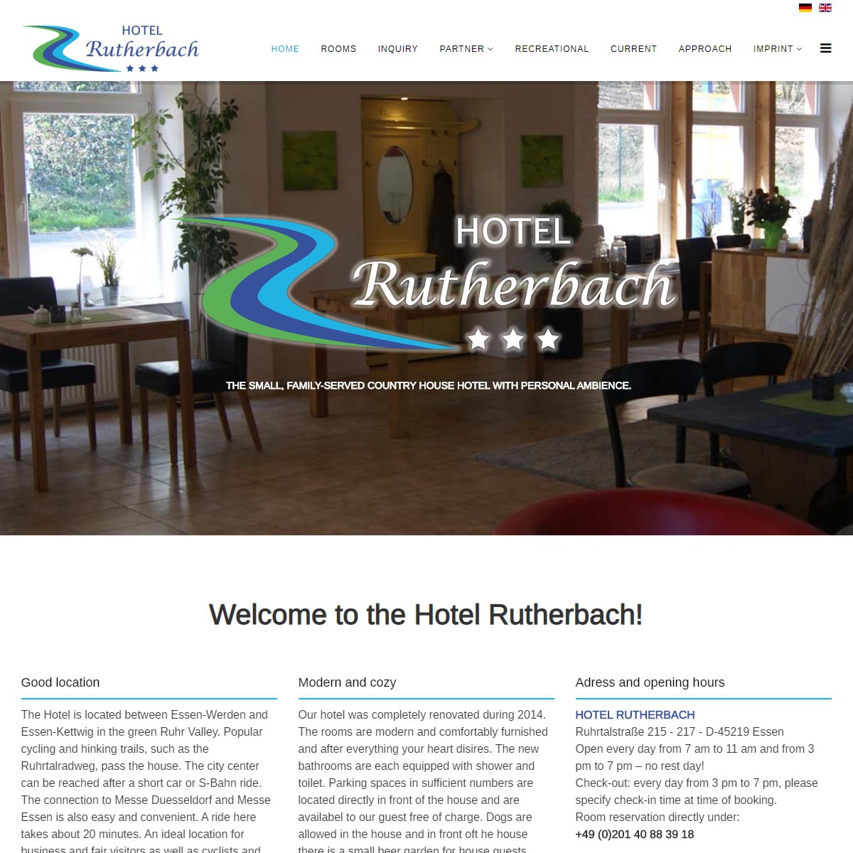
Since September 2019, the website of the Hotel Rutherbach presents itself bilingually
In addition to the standard language German, all contents of the website are now online in English.
")
")
Since September 2019, the website of the Hotel Rutherbach presents itself bilingually
In addition to the standard language German, all contents of the website are now online in English.
When some one searches for his necessary thing, thus he/she wishes to be
available that in detail, therefore that thing is
maintained over here.
I visited multiple websites but the audio quality for audio songs current at this website is genuinely marvelous.
Thanks, your work is great in this post.It is a nice post. check akscas departmental cut off mark
Hey there! I just wish to give you a big thumbs up for your excellent
information you have here on this post. I will be coming back to
your blog for more soon.
%%
%%
%%
An impressive share! I have just forwarded this onto a friend
who was doing a little research on this. And he in fact bought me dinner simply because I stumbled upon it for
him... lol. So let me reword this.... Thanks for the meal!!
But yeah, thanks for spending time to discuss this topic here on your website.
Hey very nice blog!
%%
Make sure you enter all the required information, indicated by an asterisk (*). HTML code is not allowed.
