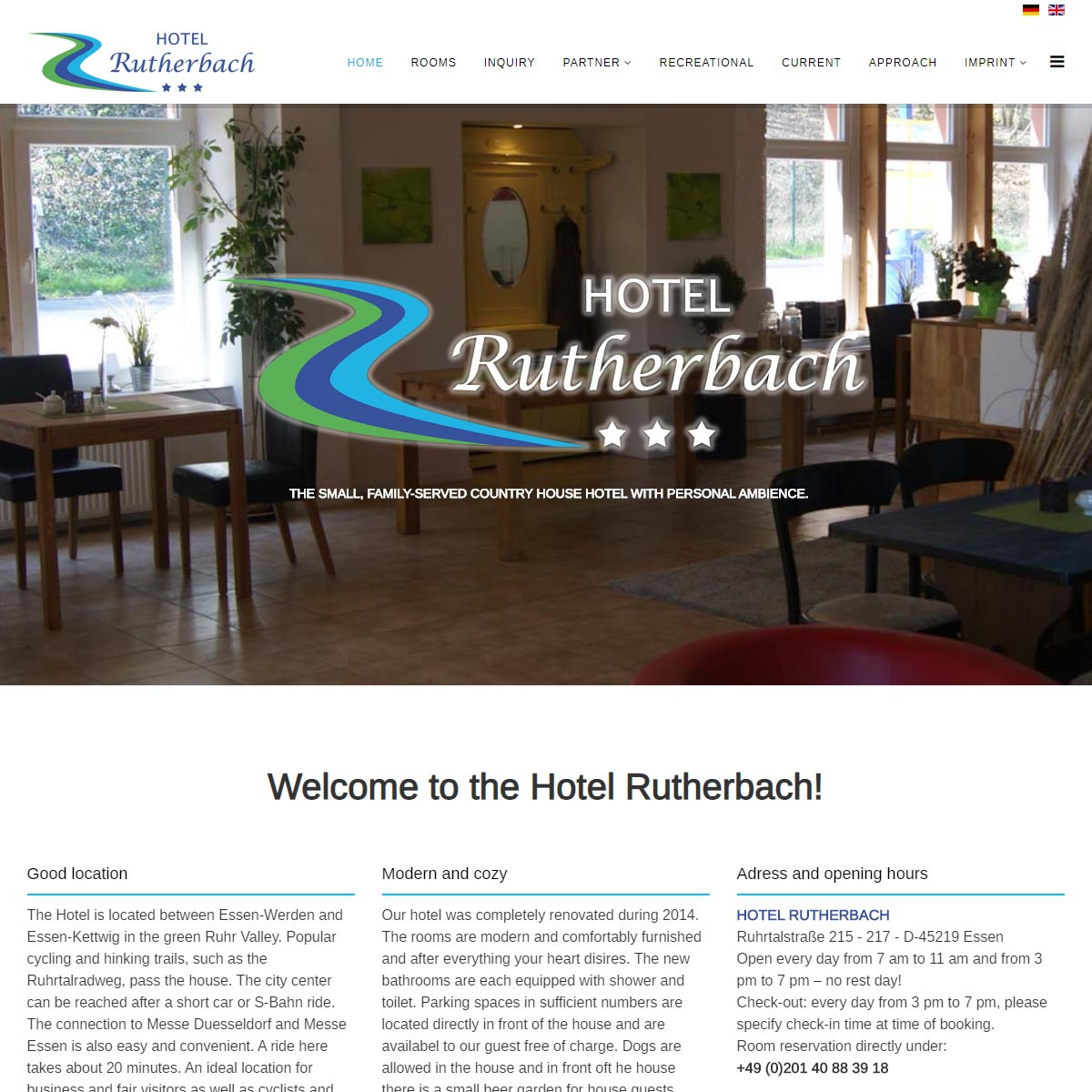
Since September 2019, the website of the Hotel Rutherbach presents itself bilingually
In addition to the standard language German, all contents of the website are now online in English.
")
")
Since September 2019, the website of the Hotel Rutherbach presents itself bilingually
In addition to the standard language German, all contents of the website are now online in English.
%%
%%
%%
%%
C'est le bon moment pour faire des plans pour
l’avenir et il est temps d’être heureux. J'ai lu cet article et si je peux, je souhaite vous suggérer quelques conseils ou
choses intéressants. Vous pourriez peut-être écrire les prochains articles faisant référence à
cet article. Je veux en savoir plus à ce sujet!
%%
%%
%%
%%
%%
Make sure you enter all the required information, indicated by an asterisk (*). HTML code is not allowed.
