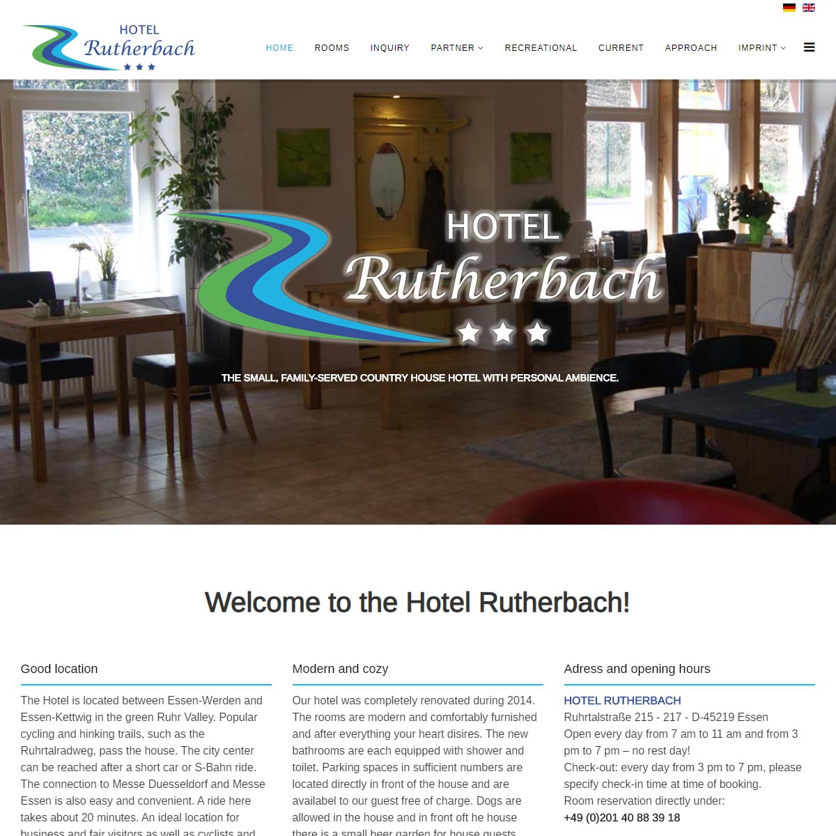
Since September 2019, the website of the Hotel Rutherbach presents itself bilingually
In addition to the standard language German, all contents of the website are now online in English.
")
")
Since September 2019, the website of the Hotel Rutherbach presents itself bilingually
In addition to the standard language German, all contents of the website are now online in English.
Heya i'm for the first time here. I came across this board and I in finding It really
useful & it helped me out much. I'm hoping to
offer one thing again and aid others like
you aided me.Gymshark backpackhttps://www.echobookmarks.win/pit-viper-goggles-28https://www.first-bookmarkings.win/miami-nights-pit-viper-32
%%
%%
%%
%%
%%
%%
Highly energetic post, I loved that a lot. Will there be a part 2?
When someone writes an post he/she keeps the image
of a user in his/her brain that how a user can be aware of it.
So that's why this piece of writing is outstdanding. Thanks!
%%
Make sure you enter all the required information, indicated by an asterisk (*). HTML code is not allowed.
