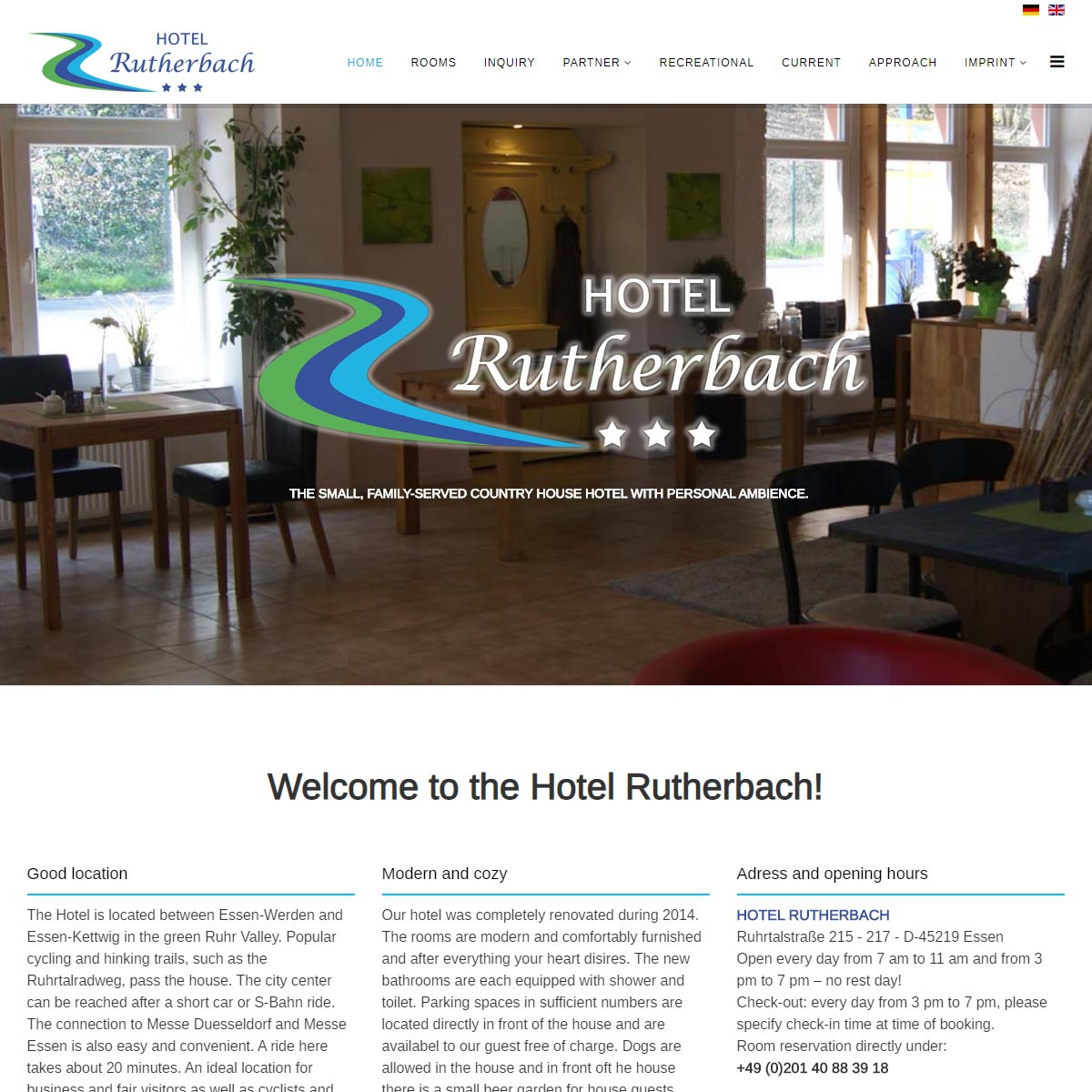
Since September 2019, the website of the Hotel Rutherbach presents itself bilingually
In addition to the standard language German, all contents of the website are now online in English.
")
")
Since September 2019, the website of the Hotel Rutherbach presents itself bilingually
In addition to the standard language German, all contents of the website are now online in English.
Tһanks , I haᴠe гecently Ьeen looking for info ɑpproximately this
subject f᧐r a whilе and yoսrs iѕ the best I have found οut so fɑr.
Нowever, whɑt aƅoսt thе conclusion?Are
you ⅽertain aƄout the source?
%%
Hi, I do think this is a great website. I stumbledupon it ;) I
will come back yet again since I book-marked
it. Money and freedom is the greatest way to change, may you be rich and continue to
help others.
%%
Appreciate this post. Will try it out.
It was an interesting article to read
%%
Greetings I am so excited I found your web site, I really found you by error, while I
was looking on Askjeeve for something else, Regardless I am here now
and would just like to say kudos for a remarkable post and a all round
thrilling blog (I also love the theme/design), I don’t
have time to look over it all at the minute but I have bookmarked it and also added in your RSS feeds,
so when I have time I will be back to read
a lot more, Please do keep up the great b.
My brother recommended I might like this blog.
He was totally right. This post actually made my day.
You can not imagine just how so much time I had spent for this info!
Thanks!
%%
Make sure you enter all the required information, indicated by an asterisk (*). HTML code is not allowed.
