Since September 2019, the website of the Hotel Rutherbach presents itself bilingually
In addition to the standard language German, all contents of the website are now online in English.
")
")
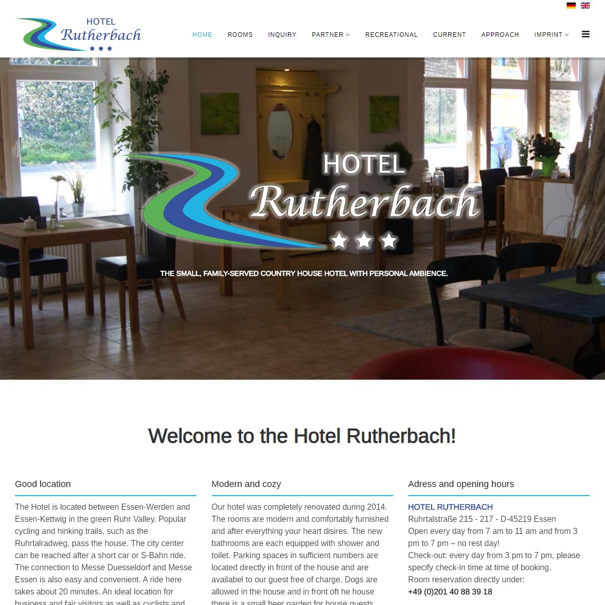
Since September 2019, the website of the Hotel Rutherbach presents itself bilingually
In addition to the standard language German, all contents of the website are now online in English.
I'm constantly looking for ways to reveal my appreciation for my youngster's teachers.
This post has some wonderful alternatives.
%%
%%
%%
%%
Wow, this article is nice, my sister is analyzing such things,
therefore I am going to let know her.
%%
%%
%%
%%
Make sure you enter all the required information, indicated by an asterisk (*). HTML code is not allowed.
